Regression and its many forms
This lab will be focused on the many ways to perform regression on single variable data. From the previous notes, we learned about linear regression. For a dataset \(\{(x_1, y_1), \dots, (x_n, y_n)\}\), linear regression uses the linear model of \[\begin{equation} y = \alpha+\beta x, \quad \alpha = \bar y-\frac{\rho s_y}{s_x}\bar x, \quad \beta = \frac{\rho s_y}{s_x}. \end{equation}\]
where we use the correlation coefficient
\[\begin{equation} \rho_{X,Y} = \frac{\sum (x_i-\bar x)(y_i- \bar y)}{\sqrt{\sum (x_i-\bar x)^2} \sqrt{\sum (x_i-\bar x)^2}} \end{equation}\]
Recall that \(\rho\) gives us a measure of the linear relationship between input and output. For nonlinear relations (parabolas, circles, etc.), the correlation coefficient will not be as effective (you may even get something near 0!). The terms \(\bar x, \bar y\) are means of the input and output, respectively, and \(s_x, s_y\) their sample standard deviations.
Let’s take a quick look at some more subtle points regarding correlation and linear regression.
0.1 Corrupting \(\rho\) with a single point
Unfortunately, correlations and linear fits are sensitive to outliers. To see this, let’s make some noise!1 By this, generate independent samples of input and output.
X = runif(100)
Y = runif(100)

cor(X,Y)
## [1] 0.1051301Q: Shouldn’t we be expecting exactly 0 as an answer? Why or why not?
By adding a single point, we can boost our correlation to be as near to 1 as we wish.
X[101] = 10^5
Y[101] = 10^5

cor(X,Y)
## [1] 1What on earth is going on? How can one point mess things up so much? Looking at the formula for \(\rho\) can help. For the augmented dataset
\[\begin{equation} \mathbf x = \{x_1, \dots, x_n, x_{big}\}, \quad \mathbf x = \{y_1, \dots, y_n, y_{big}\}, \end{equation}\] with \(x_{big} \gg x_i\), \(y_{big} \gg y_i\) The correlation coefficient is then approximated by just looking at those terms containing \(x_{big}\) and \(y_{big}\).
Q: Compute the big terms in the numerator and denominator in the formula for the correlation coefficient. In the numerator, you should be looking for terms containing \(x_{big}*y_{big}\), and in the denominator, you should be looking for terms \(x_{big}^2\) and \(y_{big}^2\). Can you find these terms and show that their ratio approaches 1 for large positive values of \(x_{big}\) and \(y_{big}\)?
Without doing the asymptotics of the previous question, we can get a visual of what our line should look like. Let’s plot our points and the line of best fit.
rho = cor(X,Y)
sx = sd(X)
sy = sd(Y)
xbar = mean(X)
ybar = mean(Y)

riggeddata = data.frame(X,Y)
linefit = function(x){
alpha = ybar- rho*(sy/sx)*xbar
beta = rho*(sy/sx)
return (alpha + beta*x)}

riggeddata %>% ggplot(aes(X,Y)) + geom_point()+stat_function(fun = linefit, col = 'red')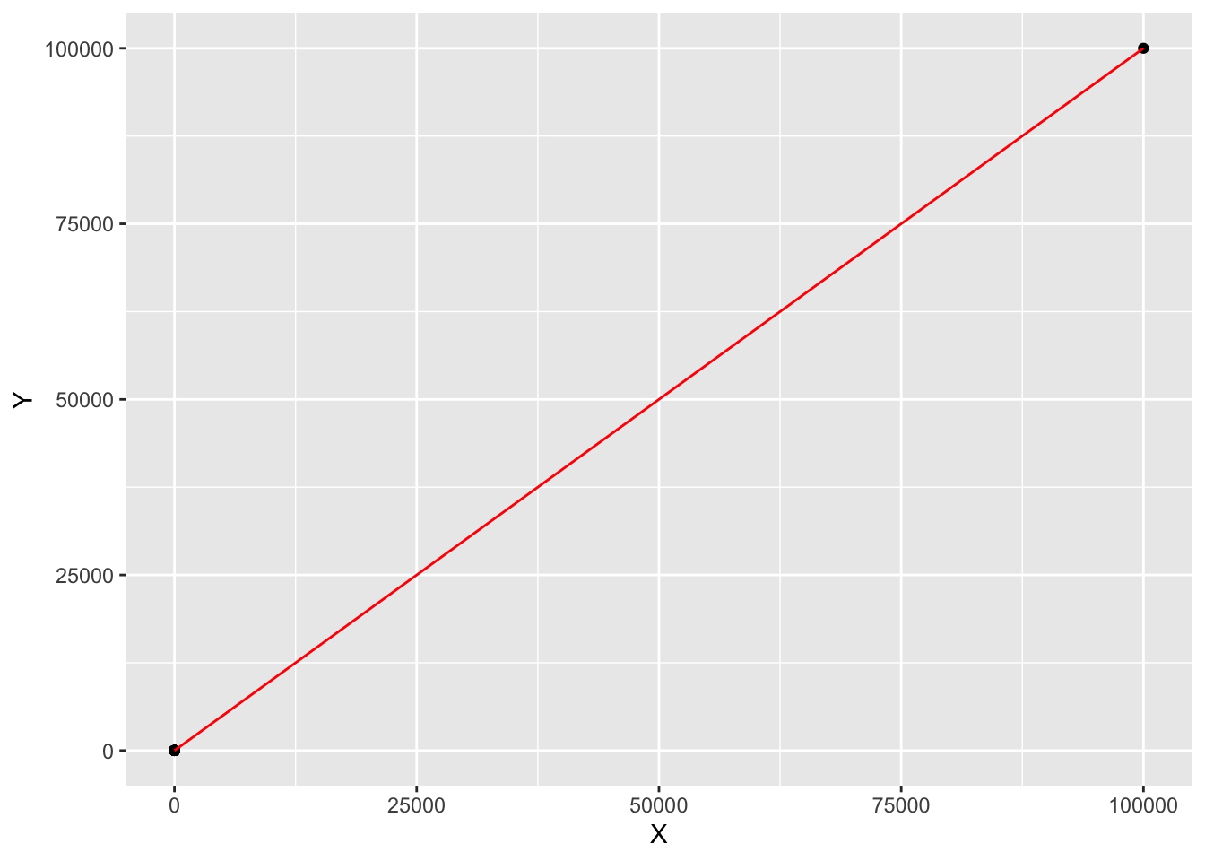
The other 100 points are so scrunched that they appear to be a single point in this graph. This graph, in a sense, is zooming out, and from this perspective, the line of best fit seems to do a pretty good job. Recall that correlations are invariant under affine transmations \(x \mapsto ax+b\), so the scaling in the \(X\) and \(Y\) variables doesn’t really matter when looking at something like a correlation.
0.2 (\(X\) vs. \(Y\)) vs. (\(Y\) vs. \(X\))
One nice property about the correlation coefficient is that it is symmetric, meaning that \(\rho(\mathbf x,\mathbf y) = \rho(\mathbf y,\mathbf x)\).
Q: Can you deduce that \(\rho\) is symmetric by looking at its formula?
Despite \(\rho\) being symmetric, we
have the curious fact that the line of best fit for \(Y\) given \(X\) is in general not the same as the line
for \(X\) given \(Y\). To see this, let’s use our trusty
<
X = iris$Sepal.Length
Y = iris$Petal.Length

rho = cor(X,Y)
sx = sd(X)
sy = sd(Y)
xbar = mean(X)
ybar = mean(Y)

linefit = function(x){
alpha = ybar- rho*(sy/sx)*xbar
beta = rho*(sy/sx)
return((alpha + beta*x))
}


#Now computing the line of best fit for X given Y:

rho = cor(Y,X)


fliplinefit= function(x){
alpha = xbar- rho*(sx/sy)*ybar
beta = rho*(sx/sy)
return((x-alpha)/beta)
}

iris %>% ggplot(aes(Sepal.Length, Petal.Length)) +
geom_point()+stat_function(fun = linefit, col = 'red')+
  stat_function(fun = fliplinefit, col = 'green')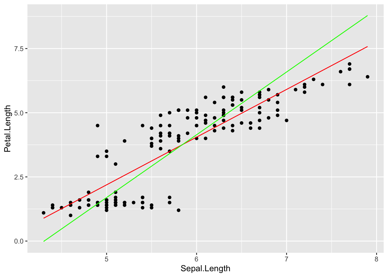
The main point here is that switching arguments produces two separate optimization problems. In the graph above, the red line is minimizing vertical residuals, whereas the green line minimizes horizontal residuals.
#Polynomial regression
We can easily generalize linear regression to cover the class of polynomials, those functions which take the form \[\begin{equation} \beta_Nx^d+\beta_{N-1}x^{N-1}+ \dots +\beta_1 x+ \beta_0 = \sum_{i = 0}^N \beta_i x^i \end{equation}\]
the variable \(N\) is called the degree of the polynomial, and is the highest power that we take of the independent variable \(x\). For fitting a degree \(N\) polynomial to a dataset, our task is to determine the best possible values for the \(N+1\) coefficients \(\beta_0, \dots, \beta_N\). We can express this as the optimization problem
\[\begin{equation} (\hat \beta_0 , \dots, \hat \beta_N) = \mathrm{argmin}_{(\beta_0, \dots, \beta_d)} \sum_{i = 1}^d (y(\hat x_i)-\hat y_i)^2 = \mathrm{argmin}_{(\beta_0, \dots, \beta_N)} \sum_{i = 1}^d \left(\sum_{i = 0}^ N \beta_i \hat x^i-\hat y_i\right)^2. \end{equation}\]
The argmin tells you to find values of \((\hat \beta_0 , \dots, \hat \beta_N)\) that produce a minimum root mean squared error \[\begin{equation} \mathrm{RMSE} = \sqrt{ \sum_{i = 1}^d (y(\hat x_i)-\hat y_i)^2/d} \end{equation}\]
These are the constants you will use to plot your polynomial of best fit.
1 An example with tracking coronavirus cases
Let’s take a look different regression models for tracking the total
number of coronavirus cases in India. We will use the
<
First, let’s take a look at case counts from March 2020 to today.
Note that we’ll be using the <
newcor = coronavirus %>% filter(country %in% c("US")
                                & type == 'confirmed'& date %in%  as.Date(1:450, origin="2020-04-01"))

newcor %>%
  ggplot(aes(x = date, y = cases))+
  geom_bar( stat = 'identity')+
  geom_smooth(color = 'pink', span = .3)
## `geom_smooth()` using method = 'loess' and formula 'y ~ x'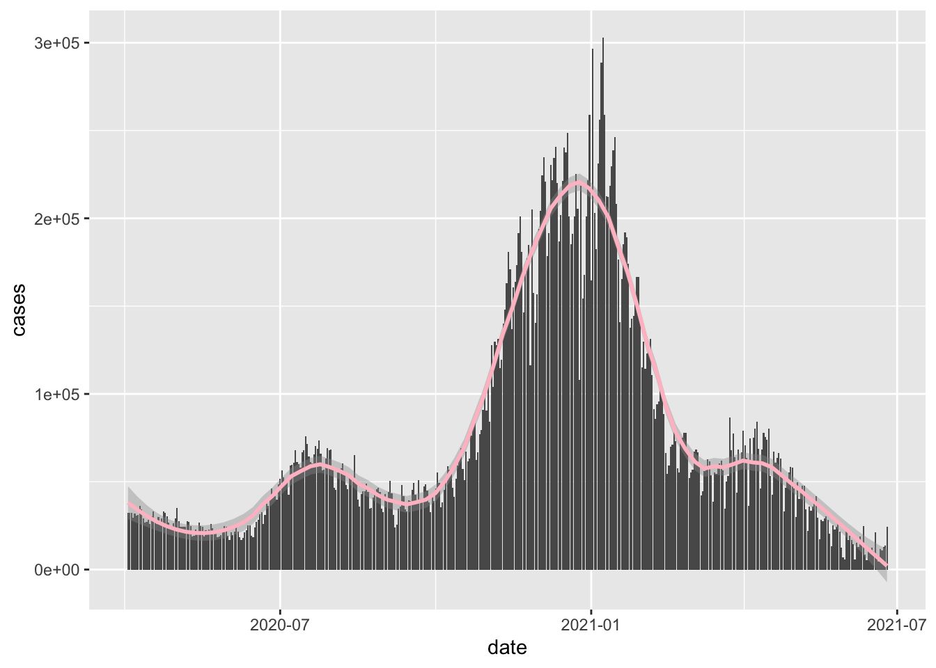
The <
Just to make things look simpler, let’s work with a new variable which gives the number of days since April 1.
newcor$day = 1:dim(newcor)[1]

newcor %>%
  ggplot(aes(x = day, y = cases))+
  geom_bar( stat = 'identity')+
  geom_smooth(color = 'pink', span = .3)
## `geom_smooth()` using method = 'loess' and formula 'y ~ x'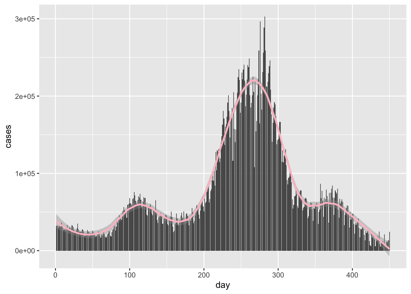
Now let’s do the unthinkable and actually try using linear regression! We should expect a pretty horrific result, but it’ll be good exercise on writing an explicit solution for an optimization problem, something that we won’t have on hand when looking at more complicated problems.
X = newcor$day
Y = newcor$cases
rho = cor(X,Y)
sx = sd(X)
sy = sd(Y)
xbar = mean(X)
ybar = mean(Y)

linefit = function(x){
alpha = ybar- rho*(sy/sx)*xbar
beta = rho*(sy/sx)
return((alpha + beta*x))
}


newcor %>%
  ggplot(aes(x = day, y = cases))+
  geom_bar( stat = 'identity')+
  geom_smooth(color = 'green', span = .3) +
  stat_function(fun = linefit)
## `geom_smooth()` using method = 'loess' and formula 'y ~ x'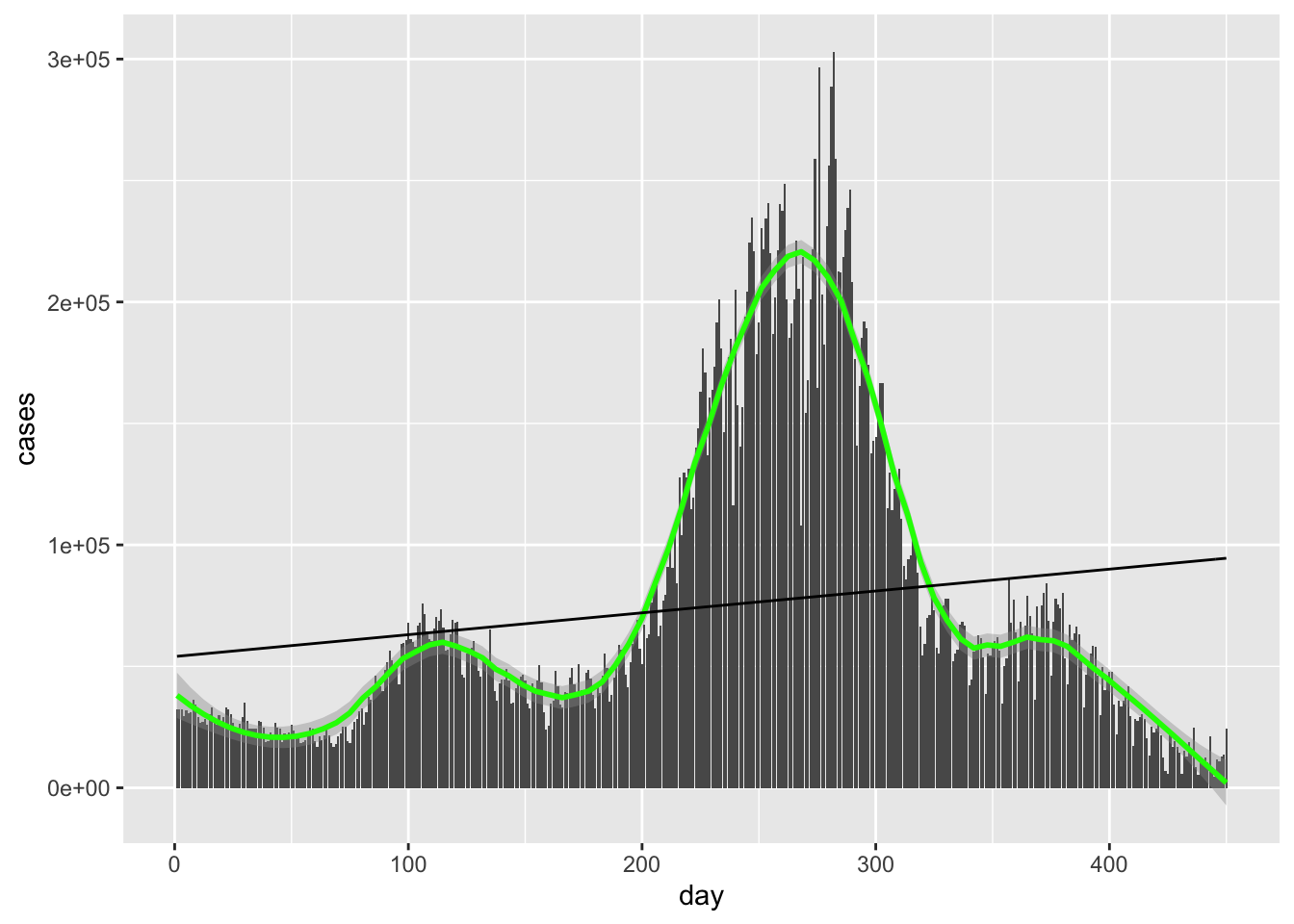 Hideous as expected.
Let’s derive the result using a direct minimization. The idea here is that we can generalize this method to regression for polynomials of whatever degree we wish.
model = function(a, data){

  a[1]+data$day*a[2]
}

#Here's the root mean squared distance function
rmsd = function(mod, data){

  diff = data$cases-model(mod, data)
  return(sqrt(mean(diff^2)))
}
Now let’s find the minimum value of our parameters with Newton’s method, the insanely fast algorithm for finding zeros of a function (those numbers \(c\) such that \(f(c) = 0\).)
#We'll just plug in random conditions in for the initial conditions.
minparams = optim(c(0,0), rmsd, data = newcor)

minparams$par
## [1] 54052.49528 89.91705We’re basically done. What remains is simply plugging in our optimal values into our linear model and comparing against the original function
newcor %>%
  ggplot(aes(x = day, y = cases))+
  geom_bar( stat = 'identity')+
  geom_smooth(color = 'white', span = .3) +
  geom_abline(intercept = minparams$par[1], slope = minparams$par[2]) +
  stat_function(fun = linefit, col = 'red')
## `geom_smooth()` using method = 'loess' and formula 'y ~ x'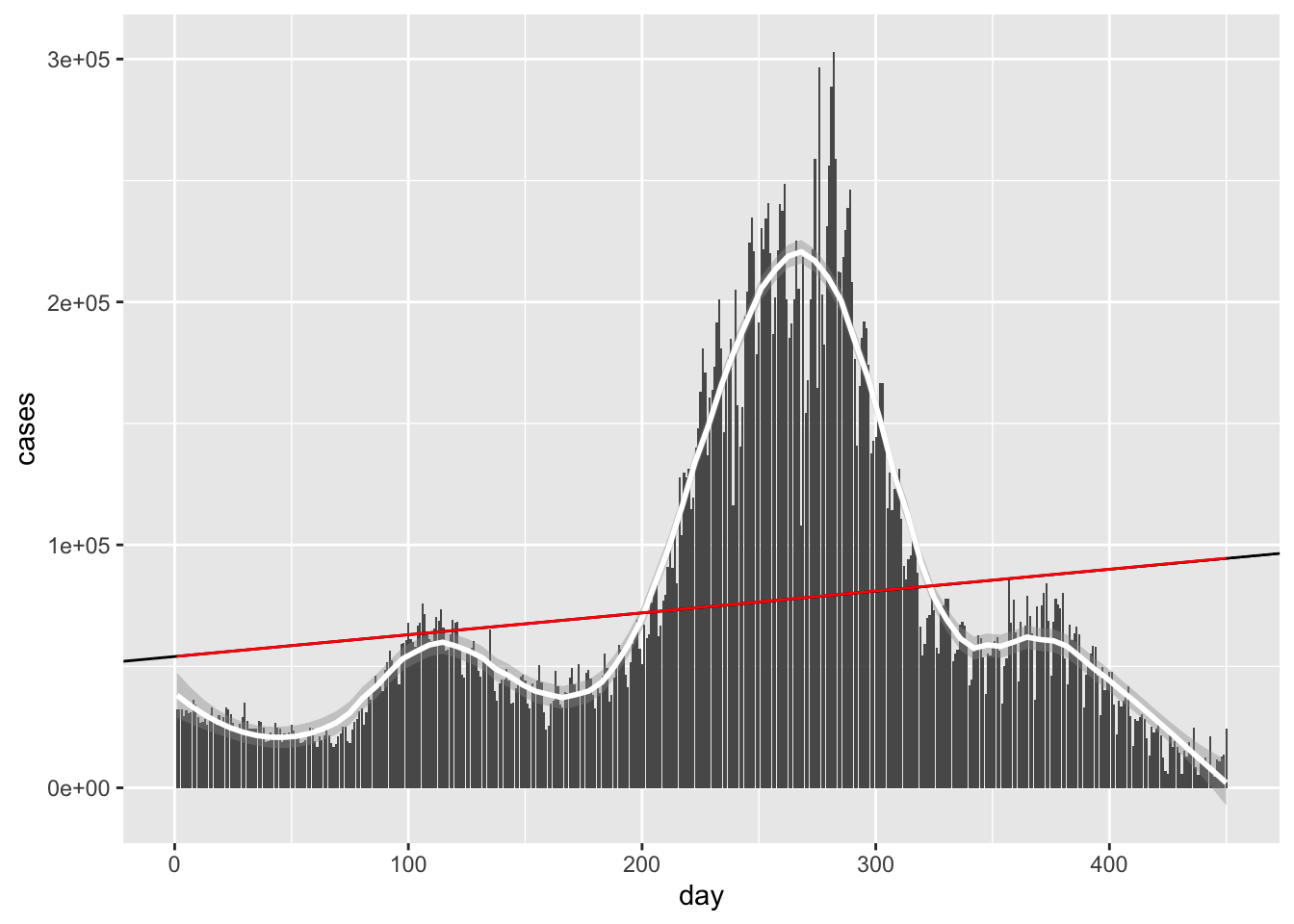
Same awful line!
Q: Hold on a second! Do we get different answers if we plug in different initial conditions? The answer, sadly, is yes. Try plugging in (0,0) as your initial conditions and see what happens. Any ideas on what might be happening? If you get different answers for different initial conditions, how do you determine which answer is the best one?
Certainly adding some degrees should help. Let’s try a cubic model.
#This model2 has 4 parameters:
model2 = function(a, data){

  a[1]+data$day*a[2]+data$day^2*a[3]+data$day^3*a[4]
}


rmsd2 = function(mod, data){

  diff = data$cases-model2(mod, data)
  return(sqrt(mean(diff^2)))
}

#Find the minimum value with Newton's method.
#Guess initial values for algorithm are (0,0)
minparams = optim(c(0,0, 0, 0), rmsd2, data = newcor)

mincubic = function(x){

  return (minparams$par[1]+minparams$par[2]*x+minparams$par[3]*x^2+
            minparams$par[4]*x^3)
}

newcor %>%
  ggplot(aes(x = day, y = cases))+
  geom_bar( stat = 'identity')+
  geom_smooth(color = 'white', span = .3) +
  stat_function(fun = mincubic)
## `geom_smooth()` using method = 'loess' and formula 'y ~ x'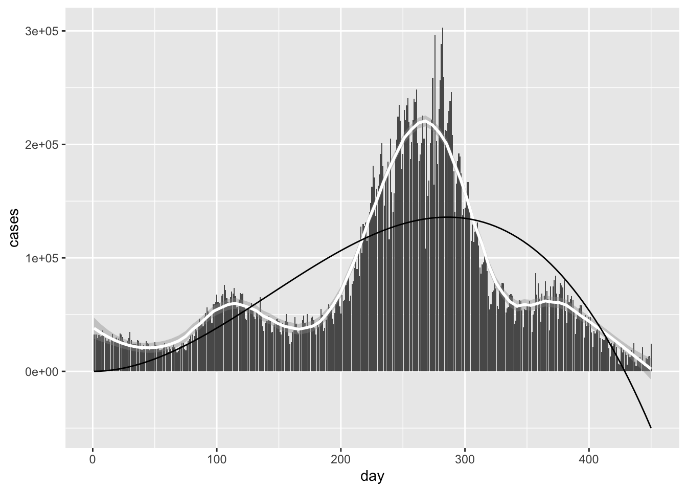
Not perfect, but certainly better! Let’s keep moving, and look at a degree 8 model. That should help us capture the hills and valleys better.
newercor = newcor
newercor$day = newcor$day/dim(newcor)[1]
newercor$cases = newcor$cases/max(newcor$cases)


power = 16
#A for loop is convenient here for writing down a degree 8 polynomial
model3 = function(a, data){
  answer = 0
  for (i in 1:power){

    answer = answer+ a[i]*data$day^(i-1)
  }
  return(answer)
}


rmsd3 = function(mod, data){

  diff = data$cases-model3(mod, data)
  return(sqrt(mean(diff^2)))
}

#Find the minimum value with Newton's method.
#Guess initial values for algorithm are (0,0)
minparams = optim(rep(0, power), rmsd3, data = newercor)

minoctic = function(x){
  answer = 0
  for (i in 1:power){
  answer = answer+ minparams$par[i]*x^(i-1)
}
return(answer)
}

newercor %>%
  ggplot(aes(x = day, y = cases))+
  geom_bar( stat = 'identity')+
  geom_smooth(color = 'white', span = .3) +
  stat_function(fun = minoctic, color = 'red')
## `geom_smooth()` using method = 'loess' and formula 'y ~ x'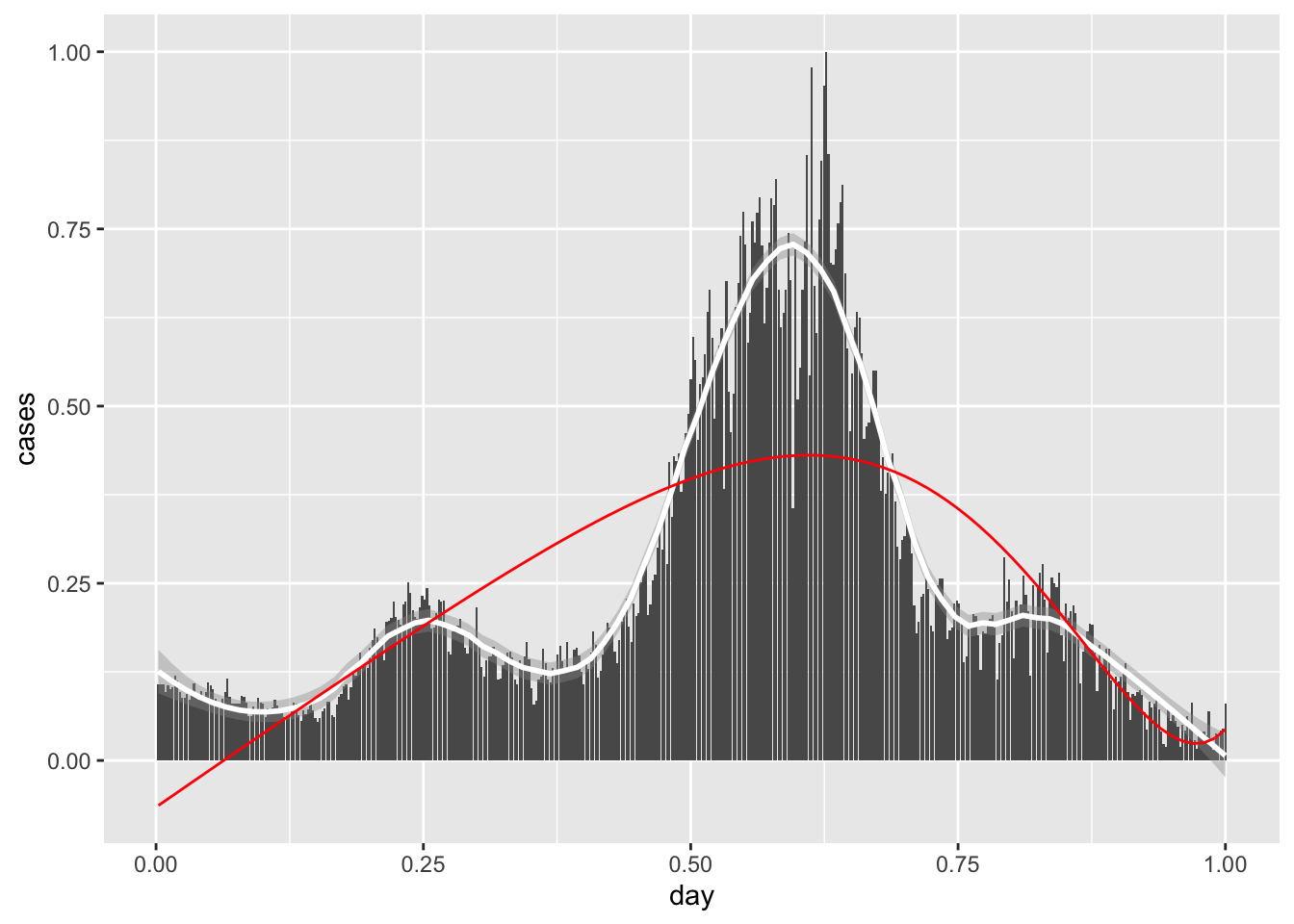
Still not quite there.
Q: The code we wrote will apply for any polynomial we choose. Poke around with different degrees and see if you can get a better fit.
Q: Poke around some more at different countries. What kinds of graphs do you think would be the easiest to fit? The hardest?
2 Local regression
We can also consider methods for building curves that approximate functions locally.This means for a particular point \(x\), my approximation \(\hat f(x)\) is based on points within a neighborhood \(B_r(x) = [x-r, x+r]\) of radius \(r\) centered at \(x\).
More precisely, given a dataset \(D = \{(x_1, y_1), \dots, (x_d, y_d)\}\), my estimated function takes the form
\[\begin{equation} \hat f(x) = \frac{1}{|A_x(r)|}\sum_{i \in A_x(r)} y_i \end{equation}\]
where \(A_x\) is the set of indices such that \(i \in A_x\) means that \(x_i\) is an x-coordinate in the dataset \(D\).
You might notice that smoothing tends to give nicer looking curves than something like polynomial regression. So why every bother with polynomial regression? In short, polynomial regression is a parametrization. At its best, regression builds a model which can be used to predict new data using only a small set of parameters, or numbers that describe my model.
Here is a thought experiment for illustrating the utility of using parameters. Suppose you want to calculate the height \(h(t)\) of a ball after dropping it from a tower.
There are three ways to obtain this curve:
Begin with a theory of constant acceleration and derive position, and test against experiment.
Take observations of the falling object and perform a quadratic regression
Perform local averaging with the same data as in (2)
Method (1) is good because it gives us an explanation for our curve based on a simple assumption. Such an assumption can be used to try explaining other phenomena. Method (2) provides us with approximate constants for \(h(t)\), but regression doesn’t give us a satisfying explanation for what’s going on. Local averaging is very nice because it can be applied to basically any curve, but its predictive power is clunky at best. One would have to store the entire dataset to ensure a prediction if we have a new datapoint.
newcor = coronavirus %>% filter(country %in% c("US")
                                & type == 'death'& date %in%  as.Date(1:400, origin="2020-04-01"))
newcor$day = 1:dim(newcor)[1]


span <- 7

#Box Kernel
fit <- ksmooth(newcor$date, newcor$cases,
               kernel = "box", bandwidth = span, n.points = dim(newcor)[1])


# #Normal Kernel
# fit <- ksmooth(newcor$date, newcor$cases,
#                kernel = "normal", bandwidth = span, n.points = dim(newcor)[1])


newcor %>% mutate(smooth = fit$y) %>%
  ggplot(aes(date, cases)) +
  geom_bar( stat = 'identity') +
  geom_line(aes(date, smooth), color="red")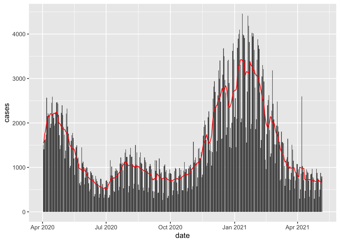
Q: This certainly beats the polynomial regression models! Why would we ever bother with polynomial regression?
No, I don’t mean this from the perspective of a cheerleader.↩︎